Assemble
Crystalizing product positioning by re-building the strategy from the ground up
PRODUCT STRATEGY, POSITIONING, BRAND DESIGN +9 MORE
Live
01
01
01
THE CHALLENGE
THE CHALLENGE
THE CHALLENGE
Assemble was becoming an increasingly complex product with an array of features across project management, file sharing and collaborative documents. The current website was filled with feature pages covering every possible use case for the software.
Users were not clear about the core value of the product, and were thus struggling to reach activation moments. I needed to make strategic decisions and choose a clear point of positioning to simplify the messaging.
To accomplish this, I would need to use a combination of product strategy, data analysis, positioning, branding and content design to create a message that resonated with our potential customers.
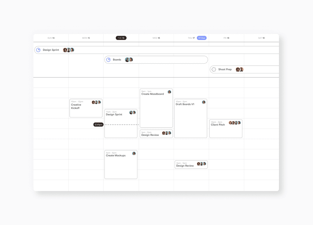
Product Mockups
I designed new product features in a simplified UI style, which became the basis for the new product re-design.
Custom Iconography
I designed original icons to visually explain the different types of collaboration that can be done in Assemble.
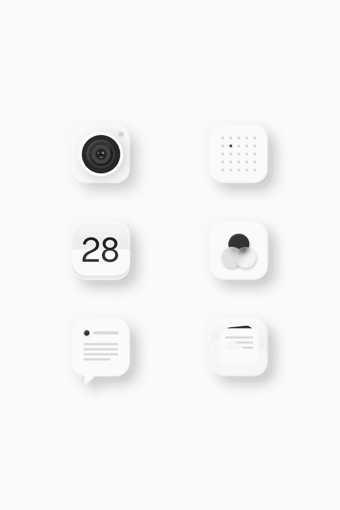
Custom Iconography
I designed custom icons to represent the various types of collaboration that can be done inside the app.
Product Mockups
I re-designed the product into a streamlined, simplified UI for the brand website. These simplified UI concepts became the foundation for the actual product re-design.
02
02
02
THE VISION
THE VISION
THE VISION
Rather than trying to sell Assemble’s vast array of features, I needed to cut through the noise and focus in on the strongest customer benefits. By researching product usage and conducting user interviews, one feature clearly stood above the rest - the calendar.
With this knowledge, I re-imagined the product strategy first and the brand strategy second. I worked with our development team to build and launch new product features that would push us in this new direction.
The goal was to create not just a new product focused around the core calendar feature, but a new way of thinking about collaboration altogether.

03
03
03
THE RESULT
THE RESULT
THE RESULT
I developed a short, clear strategic brand message and tested it to ensure that it resonated with potential customers. The new concept was simple: Organize your projects in time.
Rather than selling customers on a litany of product features, I presented them with an original and easy-to-understand concept. All of your team's collaboration, in a calendar.
This new positioning also had downstream effects inside the product, enabling us to streamline onboarding and get users to value as quickly as possible.

Midjourney Image Generation
I used Midjourney to generate photorealistic imagery and bring the product to life with stunning visuals.
Midjourney Image Generation
I used Midjourney to generate photorealistic imagery and bring the product to life by showcasing it's various use cases around asset management.
04
04
04
THE DETAILS
THE DETAILS
THE DETAILS
I synthesized many of our powerful product features into simple visual animations, enabling users to quickly understand complex concepts.
I fully designed and developed an interactive website that tells the users a story, allowing them to make new discoveries without ever leaving the page.
I synthesized many of our powerful product features into simple visual animations, enabling users to quickly understand complex concepts.
I fully designed and developed an interactive website that tells the users a story, allowing them to make new discoveries without ever leaving the page.
I synthesized many of our powerful product features into simple visual animations, enabling users to quickly understand complex concepts.
I fully designed and developed an interactive website that tells the users a story, allowing them to make new discoveries without ever leaving the page.
Visualize your Pipeline
Visualize your Pipeline
Visualize your Pipeline
See a global view of all your project timelines in one place.
See a global view of all your project timelines in one place.
See a global view of all your project timelines in one place.
Organize Instantly
Organize Instantly
Just add files to your tasks and they are automatically organized within your calendar by phase.
Just add files to your tasks and they are automatically organized within your calendar by phase.
Organize Instantly
Add files to your tasks and they are automatically organized by phase.
Animated Bento Grids
I designed and animated bento grids to clearly explain complex features in simple, easy-to-digest interactions.
I designed and animated bento grids to clearly explain complex features in simple, easy-to-digest interactions.
Motion Design
Motion Design
I utilized scroll effects and variables to implement motion design throughout the website, bringing simple buttons and interactions to life.
I utilized scroll effects and variables to implement motion design throughout the website, bringing simple buttons and interactions to life.
05
05
05
THE BRAND
THE BRAND
THE BRAND
I designed a new brand that felt lightweight, modern and intelligent, giving users a sense of organization and zen.
I designed a new brand that felt lightweight, modern and intelligent, giving users a sense of organization and zen.
I designed a new brand that felt lightweight, modern and intelligent, giving users a sense of organization and zen.
Brand Kit
Logo
Fonts
Colors
Buttons
Mark
I modernized the previous 3D cube logo into a flat mark that captures the structured, organized personality of the product.
Logo
I used a modified Arbeit Pro to create a custom typeface. The font provides the design aesthetic of Helvetica with cut edges that make it feel precise. The “almost touching” letter spacing further adds to the constructed look.