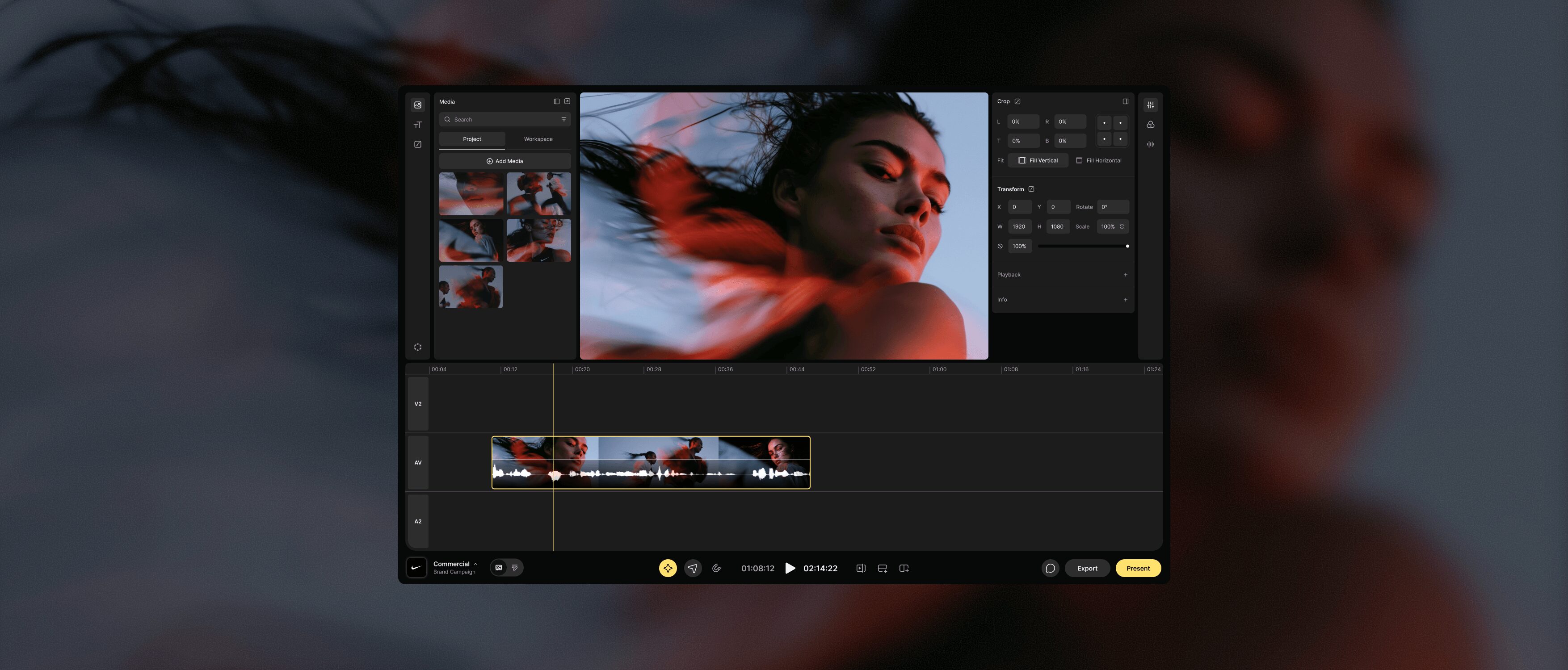
When I joined Scenery, the team had already built a fully featured cloud-based editor with a full set of AI capabilities. The product worked. What it carried was the interface debt that comes with shipping fast: every new capability had claimed its own button, its own panel, its own call to action. Chrome had accumulated on all sides of the interface, and with no visual hierarchy to rank any of it, nothing in the layout told a first-time user where to begin.
I began with a thorough research and mood boarding exercise where I looked for inspiration across a variety of surfaces. I didn't want to be confined by existing video editing tools, so I expanded my research to understand how users consumed media across various screens and devices. I found particular inspiration in more minimal experiences, such as digital car dashboards in cars like Tesla or Rivian, or consumer focused editing tools such as Instagram or Apple Camera.
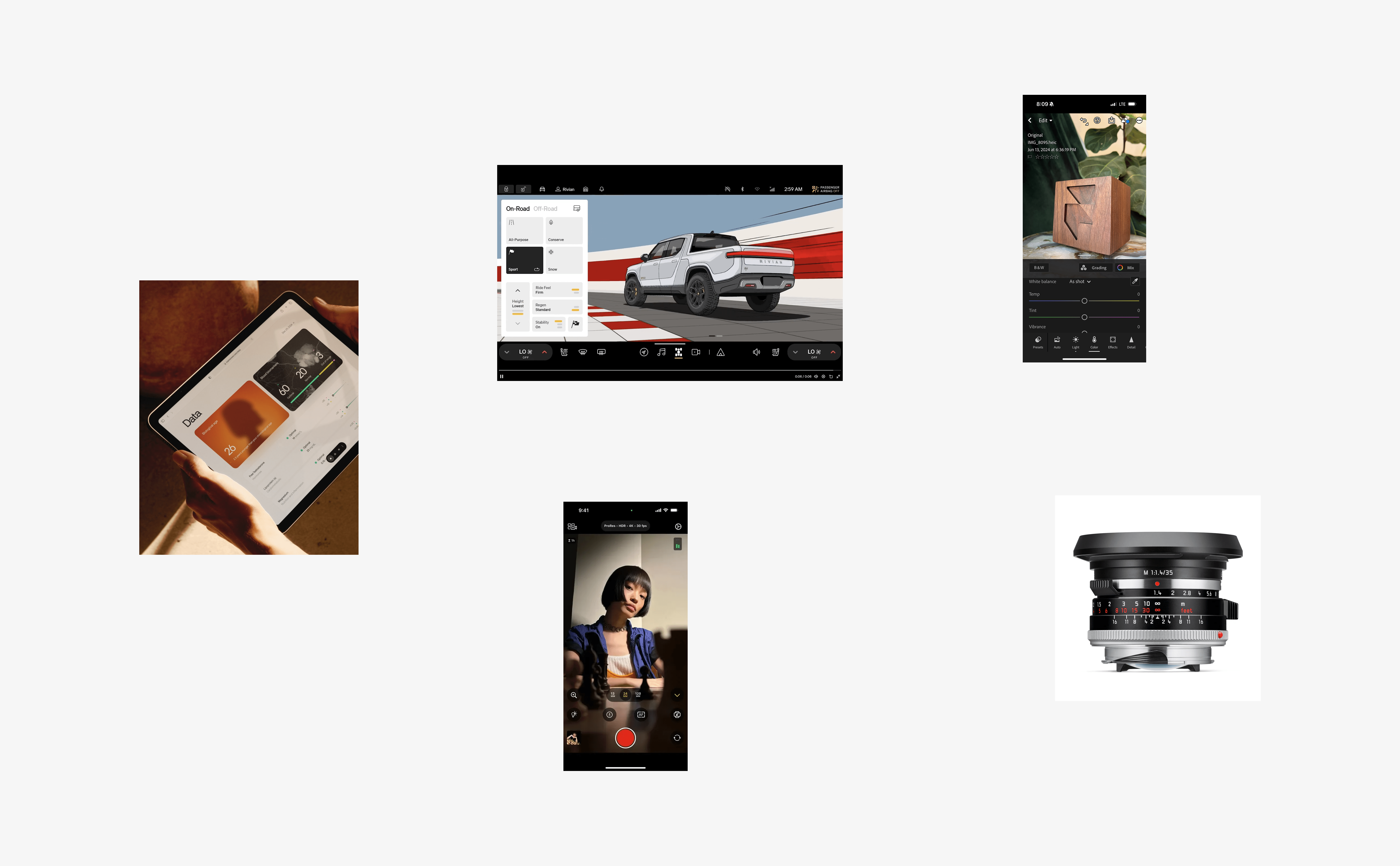
Moodboard explorations for the Scenery interface
That research surfaced an insight I kept returning to. Traditional editing tools converge on a three-tier system for distributing controls: primary actions in the top nav, secondary in a middle row above the timeline, tertiary actions along the bottom. It's a convention inherited from desktop software, and it scales in the only direction it can: by adding another row.
Consumption works the opposite way. Spotify, Netflix, and nearly every playback experience collapse to a single control bar along the bottom edge. The reasoning is simple — keep the content front and center with as few distractions as possible. If media is consumed this way, I believed it could be created this way too.
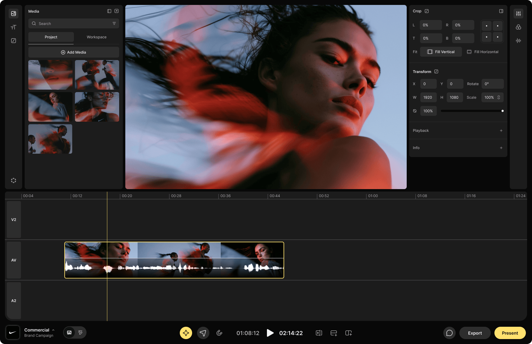
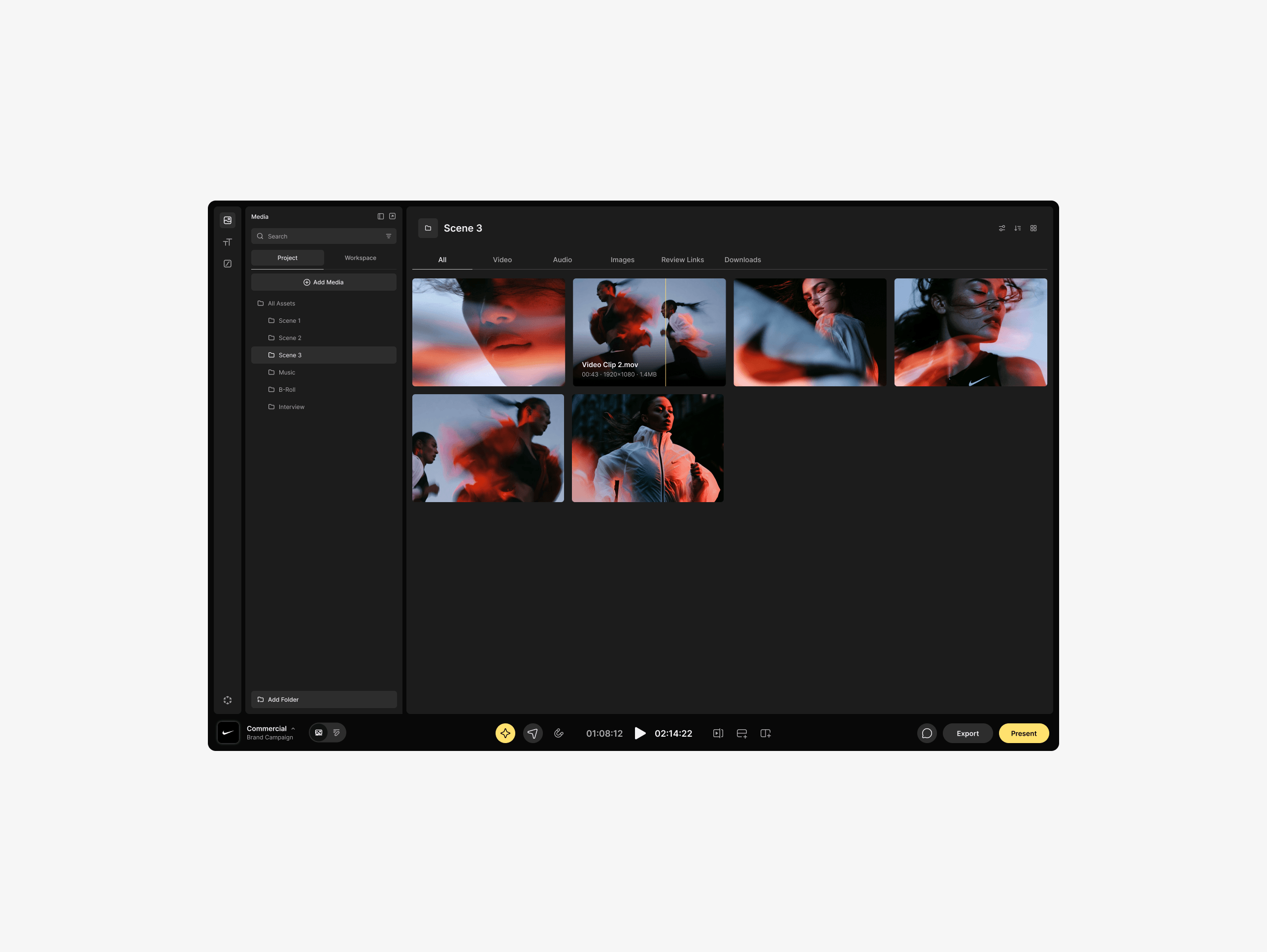
With this insight in mind I designed a modular interface that always keeps the content as the hero. Removing the top nav and middle toolbar leaves the frame feeling airy and unconstrained. Collapsible side panels let editors dial the workspace down to the content alone. And progressive disclosure collapses tools until the moment you need them. Finally, a unified bottom toolbar keeps every control within a short throw of the cursor. The distance between actions is drastically reduced, which is critically important for editors in creative flow state.
Combining the tools into a single unified toolbar was challenging. Particularly the many different editing tools that could be used to cut, modify and re-position clips. I consolidated them into a 7-in-1 tool that reaches any tool in two clicks, with keyboard shortcuts surfaced inline as visual reminders. The interface teaches its own accelerators, so users move from clicking to keyboard commands without reading documentation to get there.
I recognized a second problem in the color grading tools. No matter how often you use them, you end up dragging a slider back and forth to rediscover which direction will provide the desired effect. To solve this, I built sliders that show a visual indicator of the change they produce, so the outcome is legible before you commit to the drag.
Radial Tool Picker
Color adjustment panel
Scenery's media management lived in a separate part of the app, so reaching the full library meant leaving the edit entirely. To solve this, I created an expandable media sidebar inside the project screen that opens the entire library, across all projects, without leaving the timeline.
Mobile video editing was mostly constrained to simple point-and-shoot solutions. I wanted to find out how much of a professional suite could survive the mobile experience.
Rather than shrinking the desktop layout, I used the device itself as the organizing principle and made orientation the mode switch. Portrait gives you the clip; color adjustments, cropping, text, and the rest of the per-clip workflow. Rotate to landscape and those tools fall away, replaced by a timeline and video preview for moving, trimming, and sequencing. Select a clip, rotate back to portrait, and continue with color and titles. The phone already signals which task you're holding it for; the interface just has to agree.
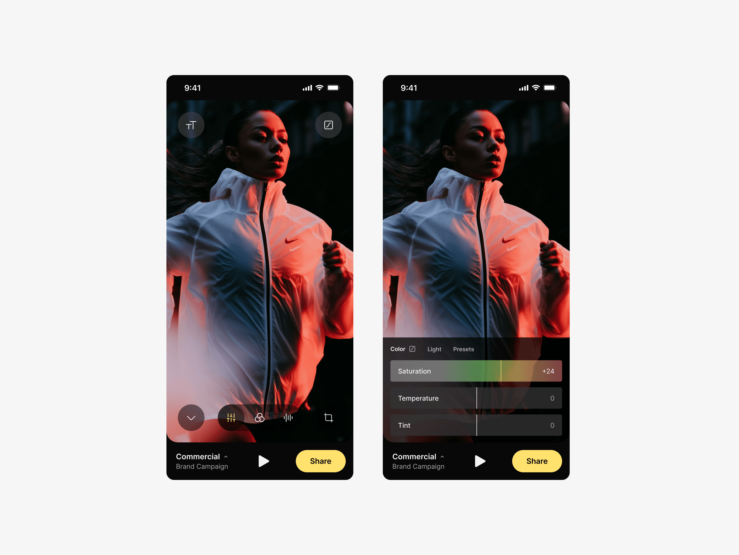
Portrait mode enables clip level modifications
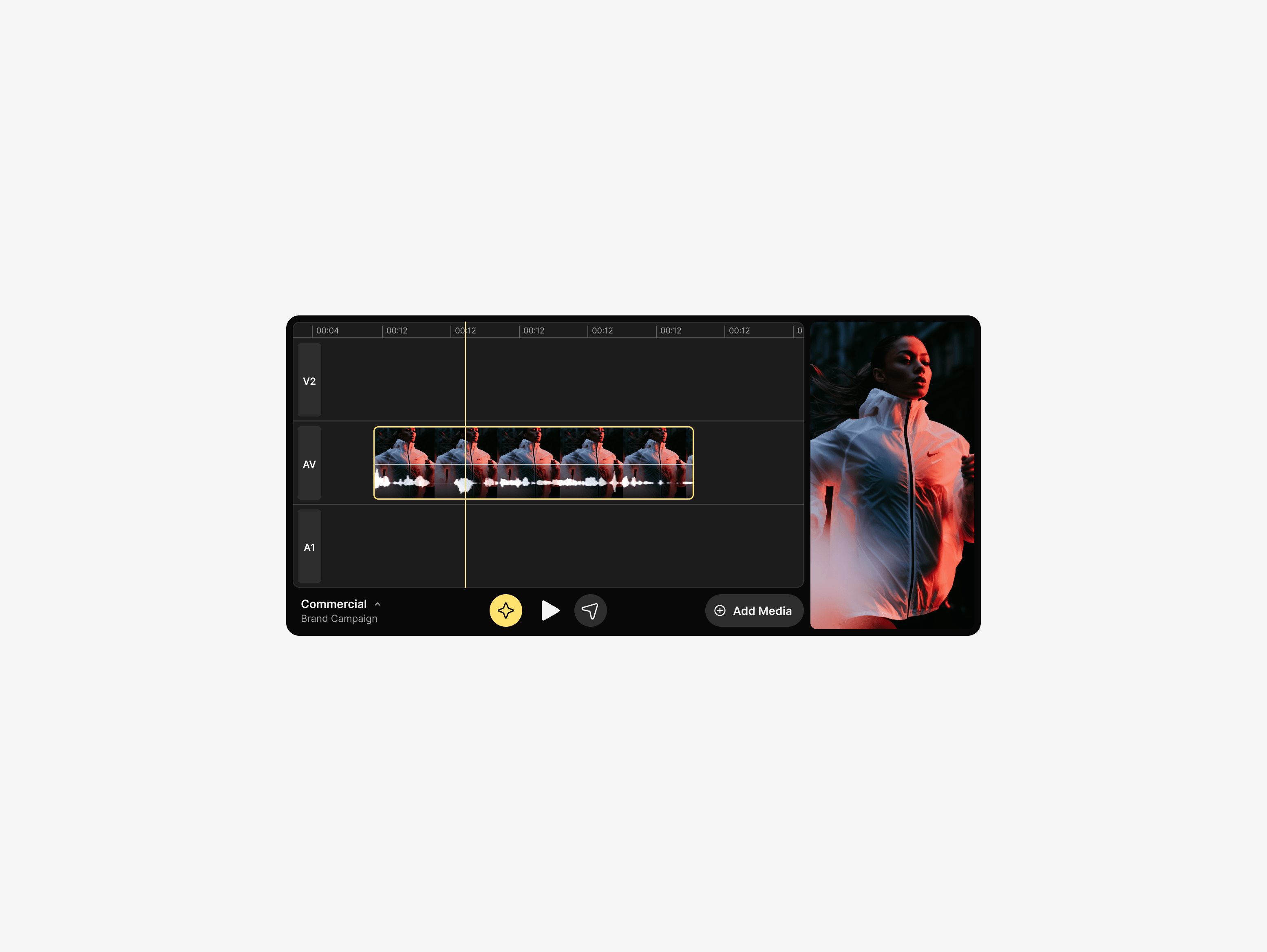
Landscape mode enables timeline level modifications
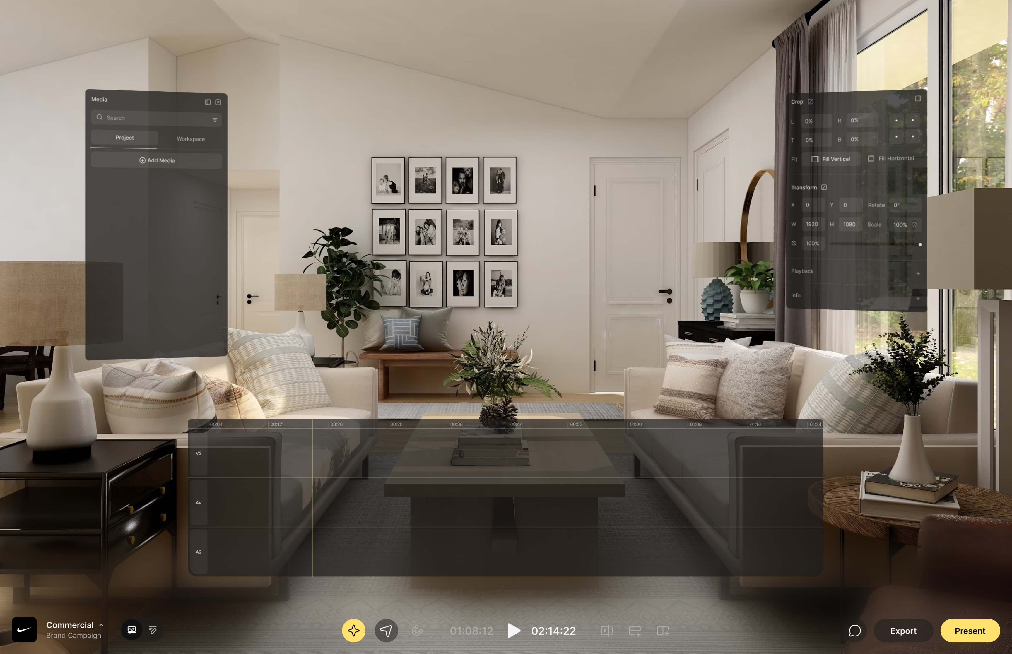
I also explored how the interface language would carry to new surfaces, including a fully immersive Apple Vision Pro application.
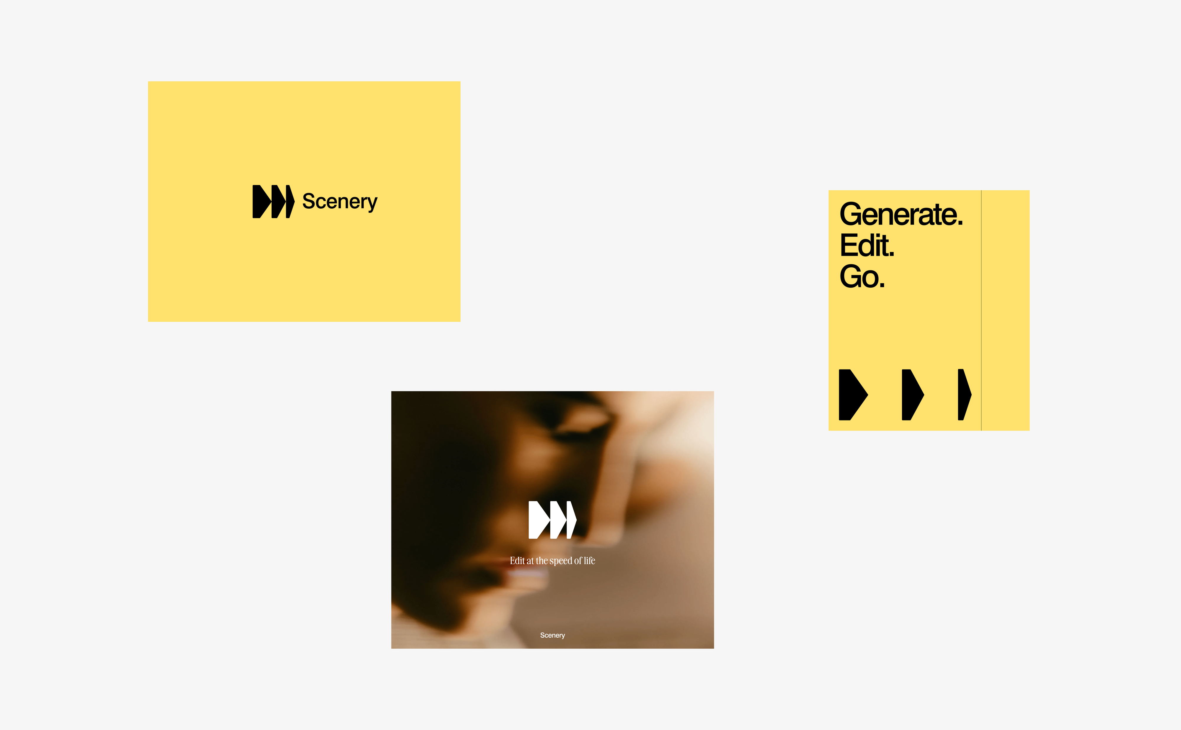
Finally, I ran early explorations around the brand including new logo marks, color, and copy. The goal was to ensure the visual and verbal identity matched the new product vision.
Skills Utilized
- User Flows
- Prototyping
- User Research
- UX Design
- Interaction Design
- Brand Design


